Cofe+ Order
A coffee ordering system including mobile, tablet app and display screen for the new robotic coffee kiosks “Cofe+” based in Shanghai.
#Team Project #Mobile #Tablet #Display Screen
Roles
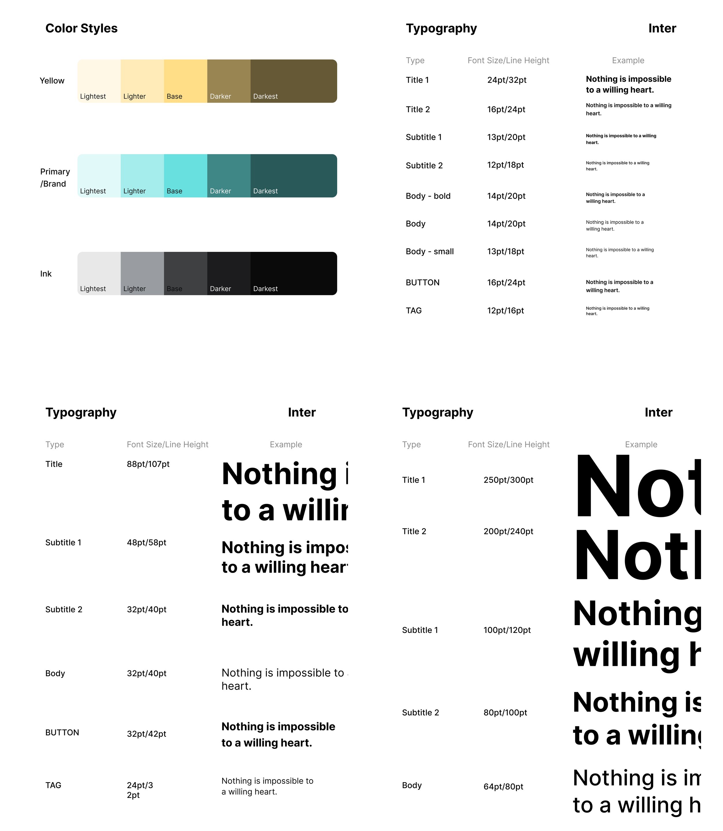
I’m the UI/UX designer of the display screen and part of the mobile app. I also designed the motions through all screens and organized the design system to keep the visual consistency.
Roles
I’m the UI/UX designer of the display screen and part of the mobile app. I also designed the motions through all screens and organized the design system to keep the visual consistency.
For the promotion video above, I took on the roles of scripting, actress and editing.
Problems
The robotic barista in the kiosk makes people feel emotionless and concerned about the coffee taste.
The client company “Cofe+“ thinks the characteristics of the robotic barista is not widely understood.
Techniques
Secondary Research, Competitive Analysis, SWOT Analysis, User Needs & Wants, Flow Design, Wireframing, Prototyping, Design System
Objective
A new ordering system —mobile & tablet app, display screen— for Cofe+ customers to order conveniently both online and offline, and to feel the warmth of robotic barista, also promote the technology of robotic arms.
01 Context
Shanghai-based start-up “Hi-Dolphin Robot Technology Co., Ltd.“ launched their new product of the robotic coffee kiosk and now needs a new integrated UI/UX deisgn of the three devices related to the kiosk: mobile app, tablet app and central display screen, to improve the online & offline experiences.
We researched the robotic coffee making technology and learned the main two attitudes towards it in today’s society:
From company’s viewpoint:
“Using robots to make coffee is undoubtedly a highly cost-effective measure because it can work 24/7 and ensure standardization and consistency in production”;
“…embracing this technological trend while integrating the unique brand identity to create an efficient and tech-driven store service is undoubtedly a natural choice”.
From customer’s viewpoint:
“Compared to human baristas, robots in coffee making lack the ability to engage in communication and provide personalized service“;
“The future direction may lie in combining the strengths of machines and humans to create a new type of coffee buying experience“.
02 Research
Market Research
Firstly, we conducted a market research of the trending products in the three categories which are most important features of our robotic cafe. They are listed below:
And we selected three to do the SWOT Analysis:
We learned from the SWOT Analysis that
A consistent theme color, or even a characteristic style across all devices can effectively strengthen the brand identity;
An introduction video of the robotic arm making products is needed to give a technological vibe and set it apart from other ordinary coffee apps;
More creative customization process can impress customers and attract new ones.
User Research
Because little comments are made towards the tablet app and central display screen, we mainly focused on the mobile app store reviews to collect customers’ opinions and sorted the reviews in the coordinate system below:
This helped us better understand the general attractive and problemetic points from customers’ points of view in mobile app ordering. We concluded that:
First, unconventional features are easy to cause non tech-savvy users to be frustrated and have negative impressions, like “broken app flow“, “unclear reward system“, etc.
but unconventional features can let tech-savvy users feel interested then have positive impressions, like “interactive images in menu“, “search bar in location page“, etc.
Second, conventional features are satisfying for non tech savvy users with shorter learning curves so they have positive reviews, like “straightforward, easy app flow“, “allergy alerts are evident“, “reliable update of pick-up time“, etc.
but conventional features are boring for tech savvy users so they have negative reviews, like “limited options in customization“, “account is required to drink even only one cup”, etc.
03 Understand the Stakeholders
Based on the maket and user research, we summarized three kinds of stakeholders, 1 business and 2 customers in user persona below to better understand user needs and pain points.
User Persona
04 Design Goals
Wrapping all collected and summarized information up, we derived a “How Might We“ and several design goals as following:
How Might We create an ordering experience with three devices that can not only promote the brand identity of Cofe+ but also be easy, clear and safe for customers ?
and our design goals are:
🎯 1. to showcase the feature of robotic arm making coffee and strenghen the brand identity ;
🎯 2. to soften the impersonal vibe of the robotic barista and provide emotional value ;
🎯 3. to enable clear and intuitive user flows of ordering, cancelling and reward system ;
🎯 4. to ensure customers feel safe placing orders and enjoying the benefits of technology.
05 Solutioning
Brainstorm : Selected features fitting the four design goals
With design goals in mind, our team of 10 brainstormed solutions, then had discussions with the client company “Hi-Dolphin” to sort them in a hierarchy: Must Have, Nice to Have and Not Necessary. Then we reserved all “Must Have” and selected several “Nice to Have” solutions as the features we would focus on in the next stage.
Flow Design : Order 👉 Track 👉 Pick Up / Cancel
Then I designed the overall user flows among the machines: mobile, tablet, display screen and the robotic barista to make them as reasonable and simple as possible.
There are mainly four parts: Order, Track, Pick Up and Cancel.
Wireframing
With the overall user flows in mind, we broke into 3 groups for the wireframing of 3 devices :
Group 1 for Mobile App : 2 members
Group 2 for Tablet App : 1 member
Me for Display Screen :1 member
Usability Tesing & Iterations
More than 5 users participated in the usability testing and gave us feedback on the wireframing. Then we made several iterations on 3 devices as following :
Character Design : Representing the brand identity with multiple expressions to reduce the impersonal vibe of robotic barista
One important “Must Have“ feature is the engaging character with interactions to guide the ordering process on 3 devices.
We brainstormed and drew several drafts then compare them together in 2 iterations and 1 adaptability test on mobile app’s homepage and customization page:
We decided to continue with Plan C with a better adaptable visual effects in use interfaces.
By introducing this, we hope it can combine the characteristics of machines and humans to create a new type of coffee buying experience.
06 Design System
I took on the role of organizing the design system in our team.
07 Prototyping
Hi-Fidelity Prototype
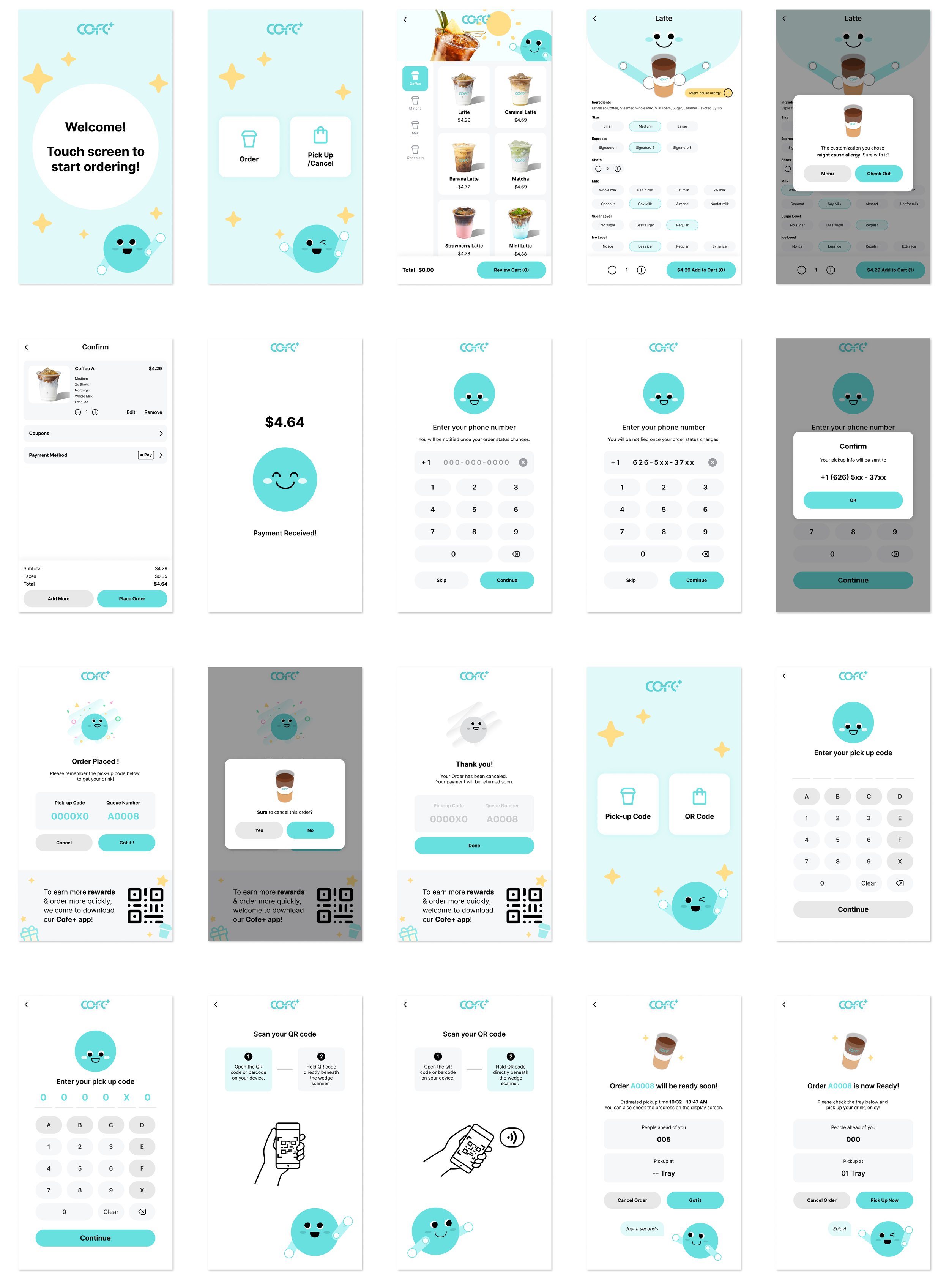
It is clear that at the low-fi stage, we have very different visual design style to express ideas.
Aftercreating the design system, we got a visually consistent prototype, which strengthened the brand identity of “Cofe+“.
Mobile App
Tablet App
Display Screen


